Greenly Plant
Philadelphia
2024
01.Overview
This project aims to evaluate and improve the usability of Greenly Plant Co, an e-commerce site that offers a curated selection of houseplants and plant care products. The purpose is to assess how well the site supports its users, uncover usability concerns, and tie those findings back to established UX principles. By integrating research, user personas, usability testing, and heuristic evaluation, the project identifies important pain spots in current design and lays the groundwork for future redesign opportunities.
Greenly Plant Co's website is meant to show off its carefully chosen selection of houseplants, accessories, and eco-friendly home goods. It also wants to promote local art through ceramics and other handmade items. The goal is to be a one-stop shop for plant enthusiasts in Philadelphia and beyond, both online and in person. In addition to selling products, the website helps its community by providing a vendor application that enables local producers to collaborate with the brand.
Goals
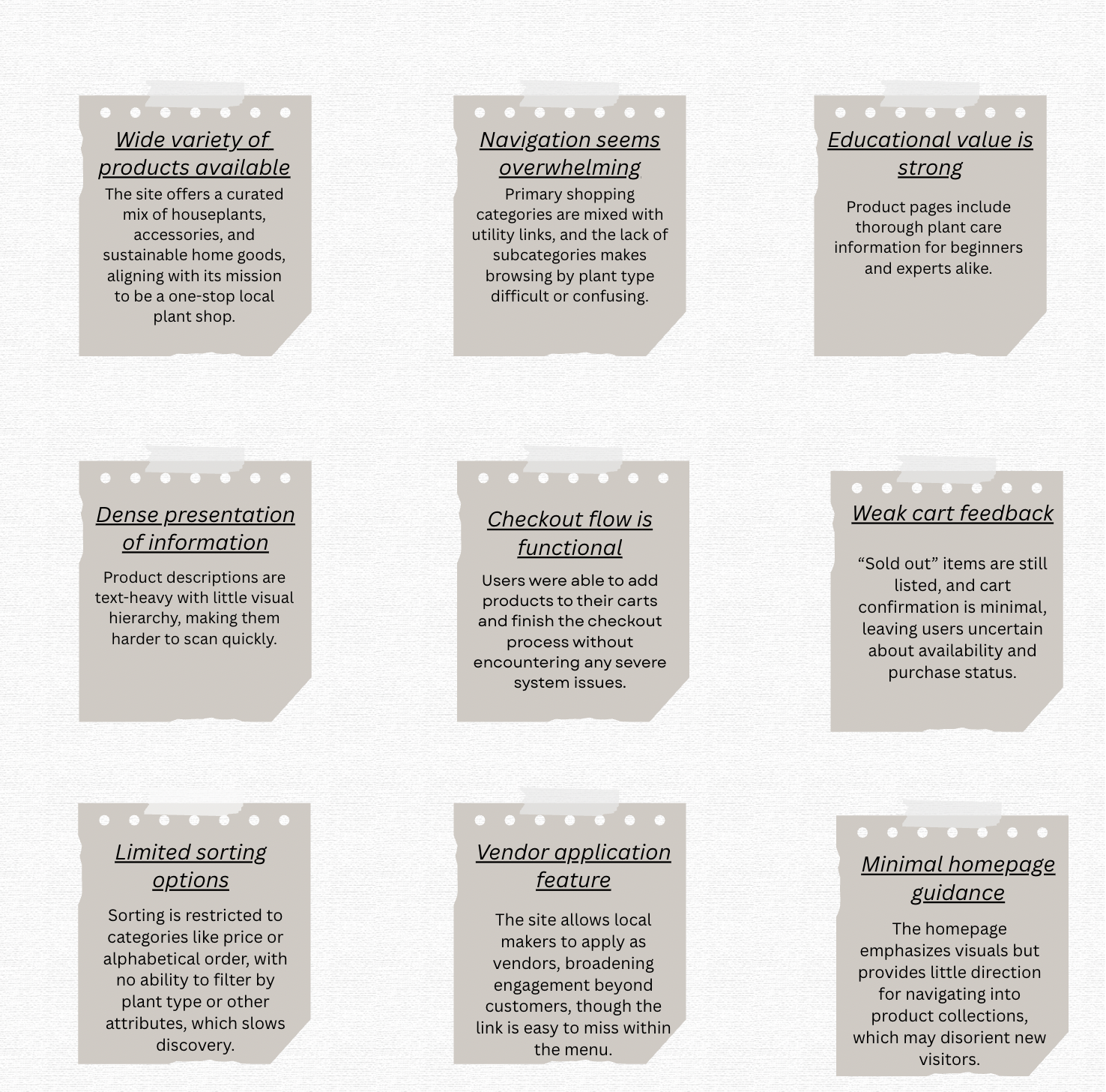
The site includes dropdown menus for Plants, Accessories, and Home Goods . The user can filter the items by alphabetical order, price, best selling, or date added. Users may see if an item is in stock by clicking on the "In Stock" tab. Quick links take them to account management, store policies, and search. A vendor application feature makes it easy for local partners to apply online. Users can view the extensive care instructions (light, water, ex.), and choose the size of the pot. These features make it easier to browse, shop, and interact with vendors, but the absence of subcategories and restricted sorting options can makes it harder to find products.
Affordances
The navigation looks cluttered and the hierarchy is not clear. The main purchasing categories (Plants, Accessories, Home Goods) are mixed up with links to useful information (Login, Policies, FAQ), which can be overwhelming for new users. Without plant subcategories, users cannot browse by type (such bonsai or tropical), and there aren't many ways to classify plants. Items that are sold out stay posted without clear labels, and there isn't much input from the cart, which makes it hard for users to know if they are still available. Going back to the homepage or a wider menu isn't always easy, which slows down the shopping process.
Problem
To better understand how users experienced the platform, I conducted usability testing and a heuristic evaluation. Through observing real user interactions and analyzing the interface against established usability principles, I was able to identify key strengths and pain points across navigation, content, and overall usability. These insights helped inform design decisions and highlight opportunities to improve clarity, structure, and user flow.
02.Research
Usability Testing
To learn how real users encountered Greenly Plant Co's website, I conducted observational usability testing with volunteers who were unfamiliar with it. A typical script was modified to focus on primary flows such as browsing products, sorting options, reviewing item details, adding products to the cart, and proceeding to checkout. During the sessions, I walked participants through specific tasks, watched their navigation choices, and recorded their behaviors, hesitations, and frustrations. This process highlighted where the site supported user goals smoothly and where difficulties arose, providing context for the resulting insights.
Insights
03.Defining the User
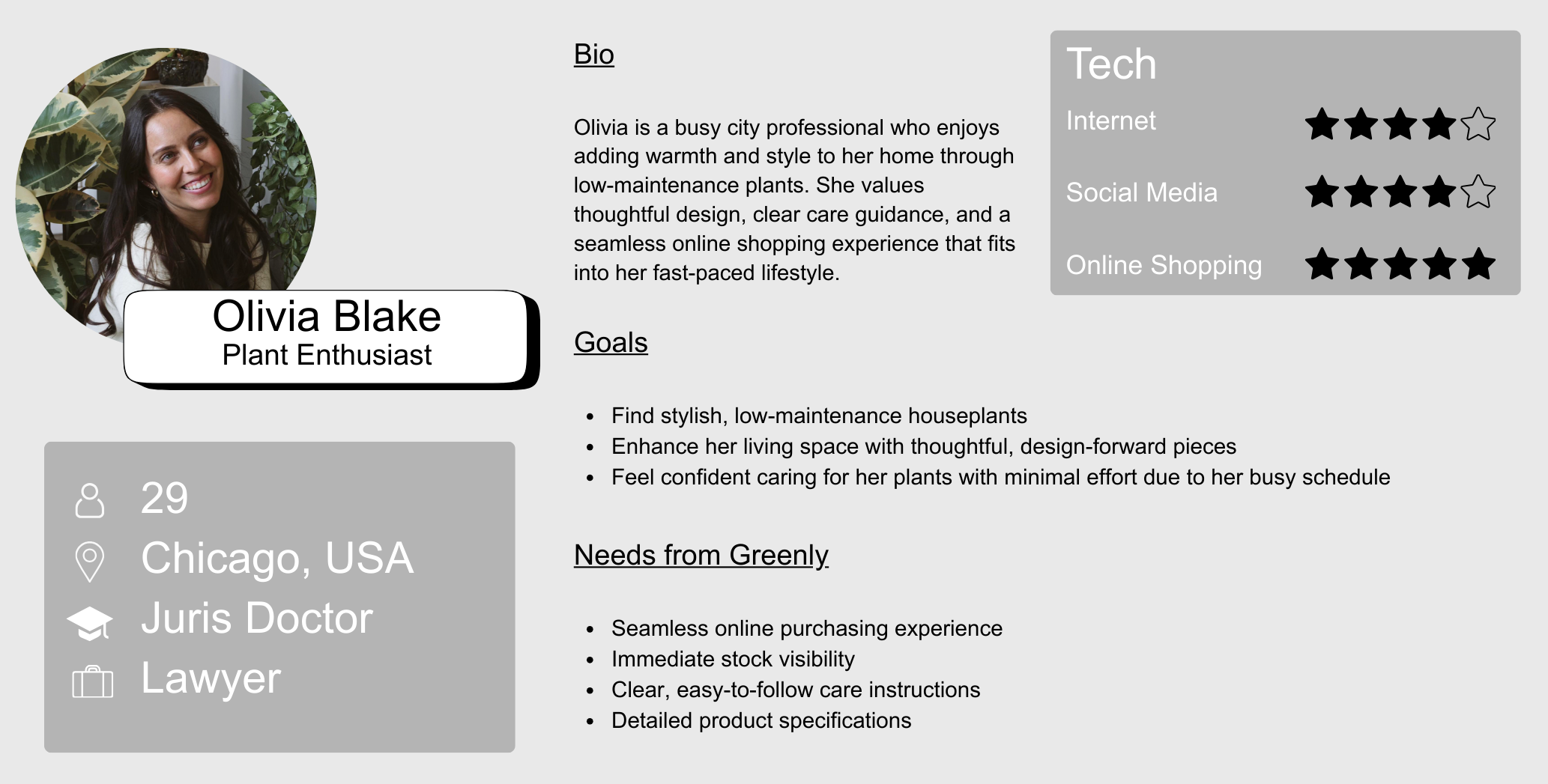
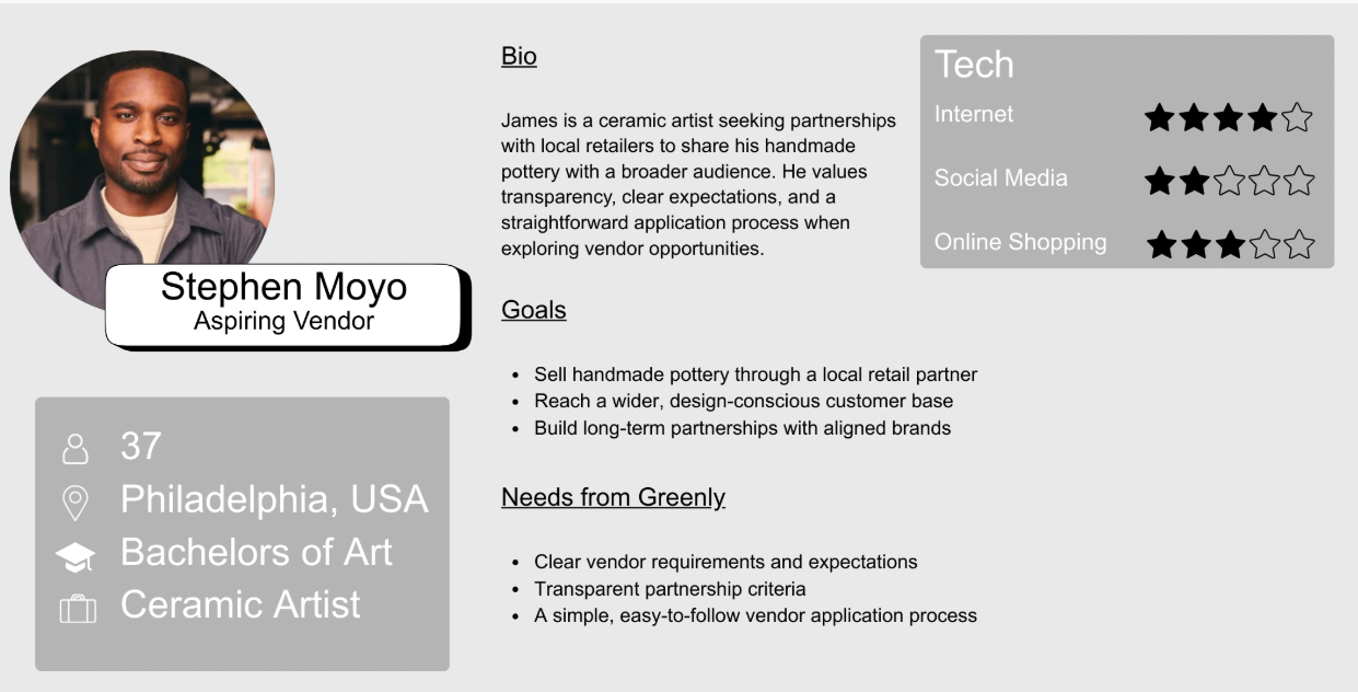
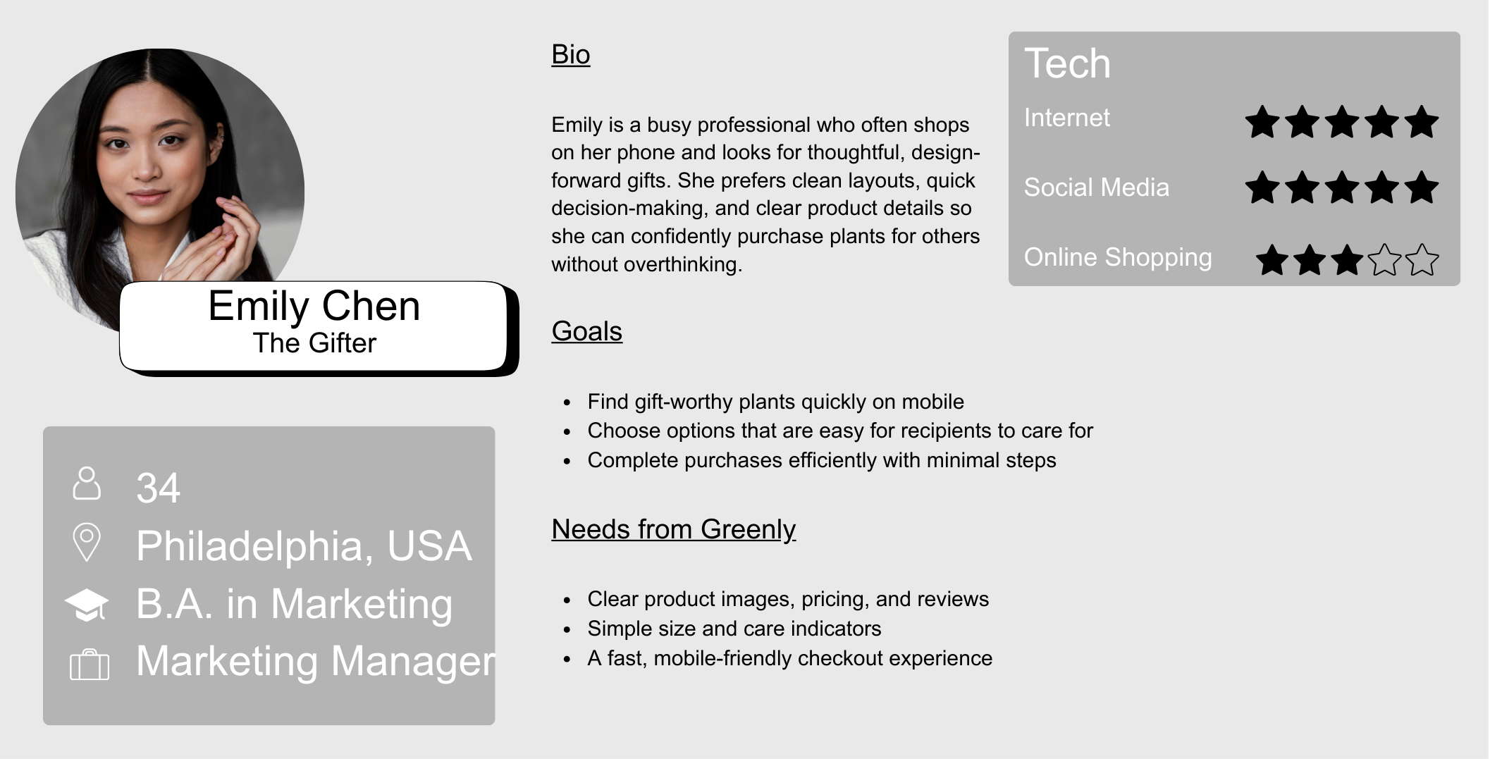
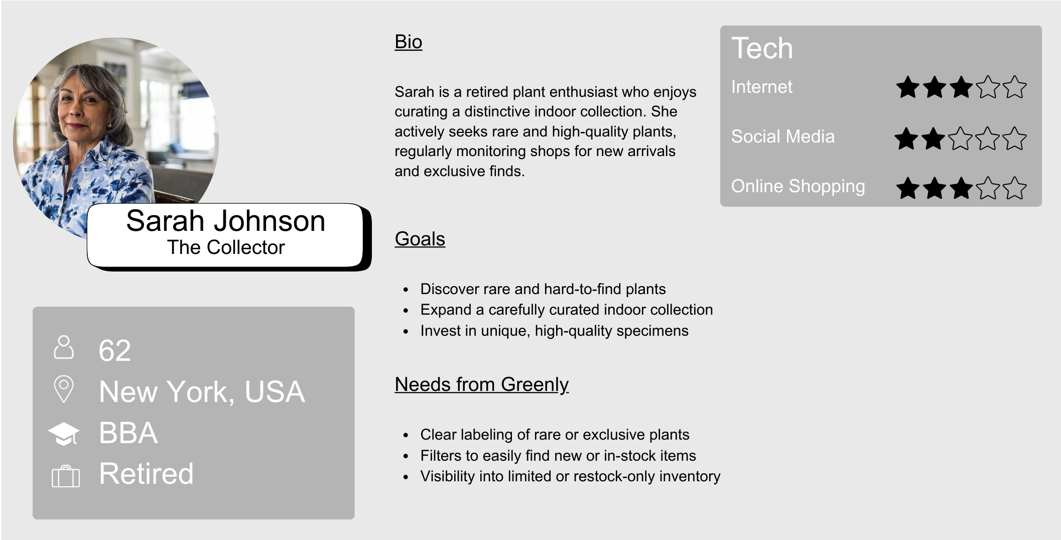
I developed four user personas to represent key user groups interacting with the Greenly website, including a casual plant shopper, a gift buyer, a collector, and a potential vendor. Each persona highlights different goals, behaviors, and needs, from quick and easy purchasing to more detailed product exploration and partnership opportunities. These personas helped guide design decisions by ensuring the experience supports a range of users with different levels of intent and familiarity.
User Personas
04.Wireframes
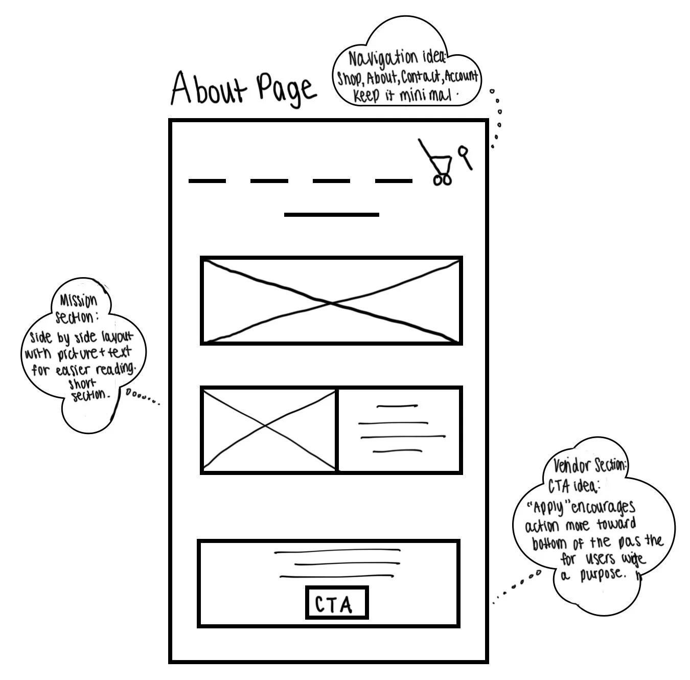
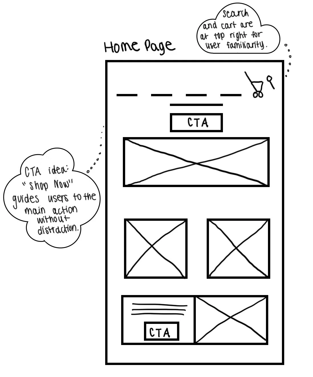
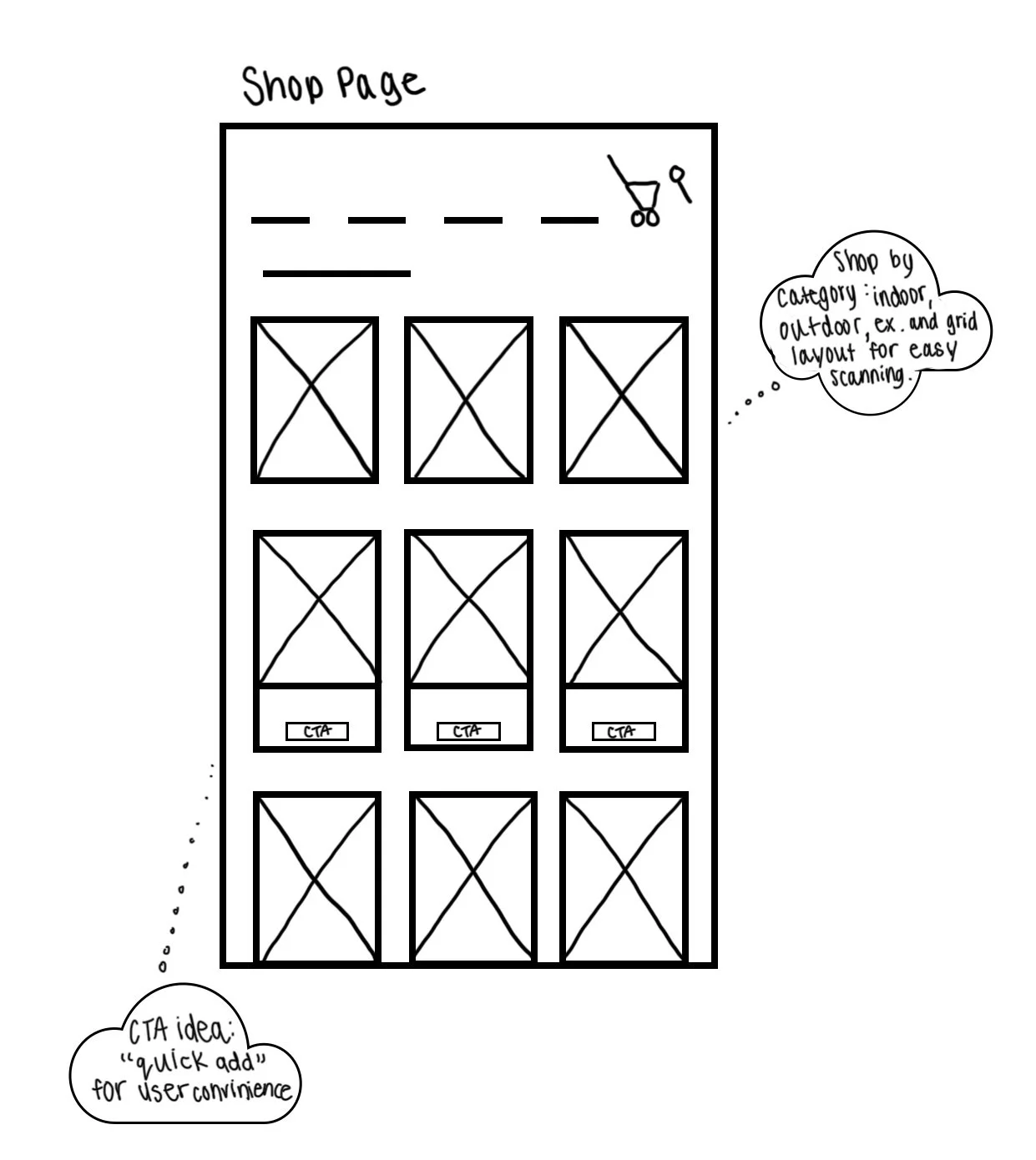
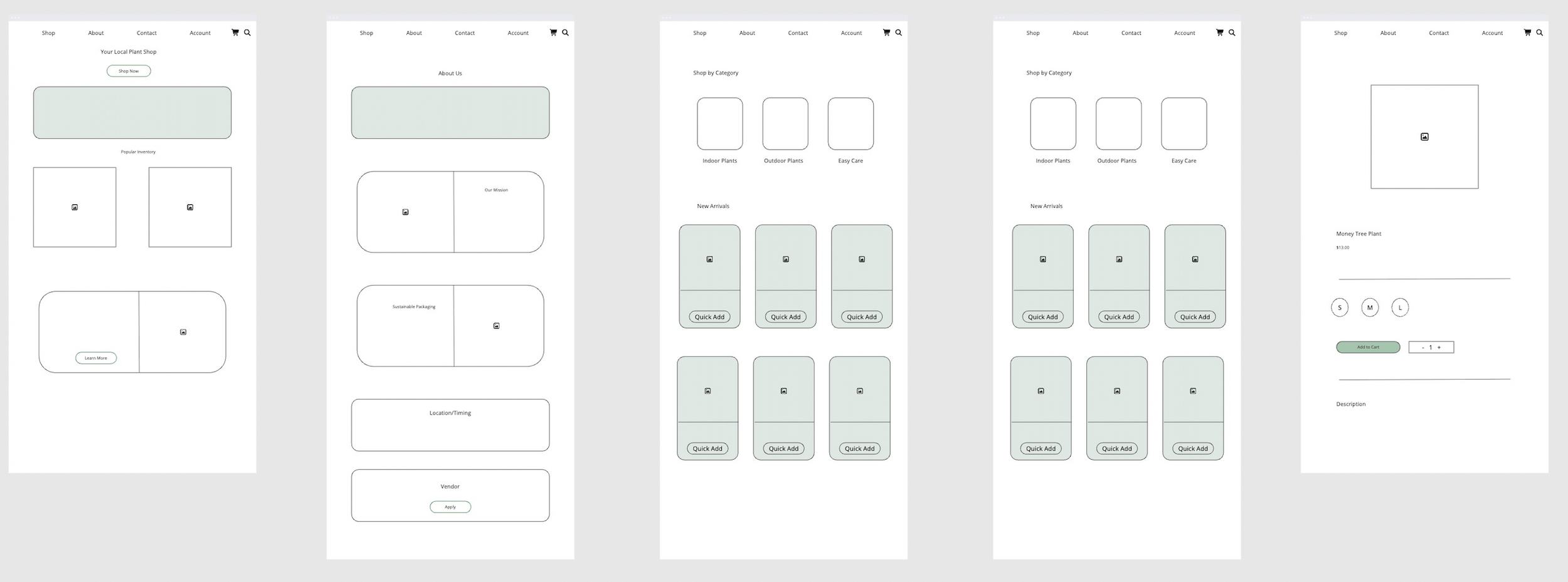
I began with low-fidelity sketches to explore the layout and structure of key pages, focusing on clear navigation and guiding users toward main actions like browsing and purchasing. I then developed mid-fidelity wireframes to refine content hierarchy, product organization, and features like quick add and category browsing. This process helped ensure the experience was intuitive and supported both easy exploration and efficient decision-making.
Low-Fidelity Wireframes
Mid-Fidelity Wireframes
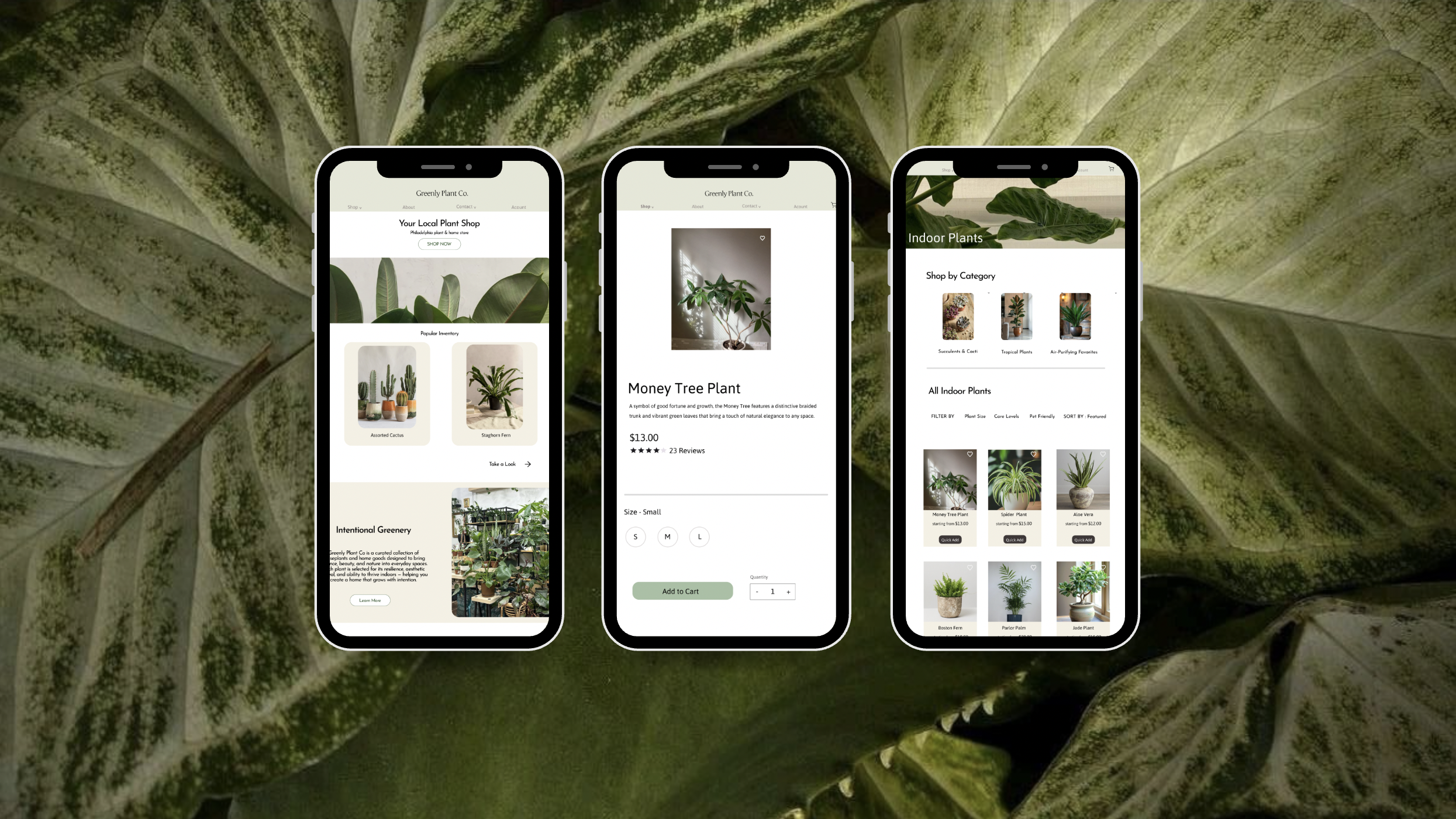
SOLUTION
SOLUTION
Reflection

Through designing the Greenly website, I learned how important it is to structure an e-commerce experience in a way that supports both quick browsing and more intentional decision-making. While creating the home, shop, and product pages, I focused on organizing content so users could easily move from discovering plants to making a purchase without confusion. For example, simplifying categories and adding features like “quick add” helped streamline the shopping process, while still allowing users to explore products in more detail when needed. This made me more aware of how layout and hierarchy directly impact how easily users can navigate and interact with a site.
I also gained a better understanding of how different types of users approach the same platform. Some users want to quickly find a product and check out, while others need more information, like care instructions or detailed descriptions, before making a decision. Designing for these different behaviors pushed me to think more intentionally about balancing clarity with depth. Overall, this project helped me focus on designing an experience that feels simple and intuitive, while still supporting a range of user needs.